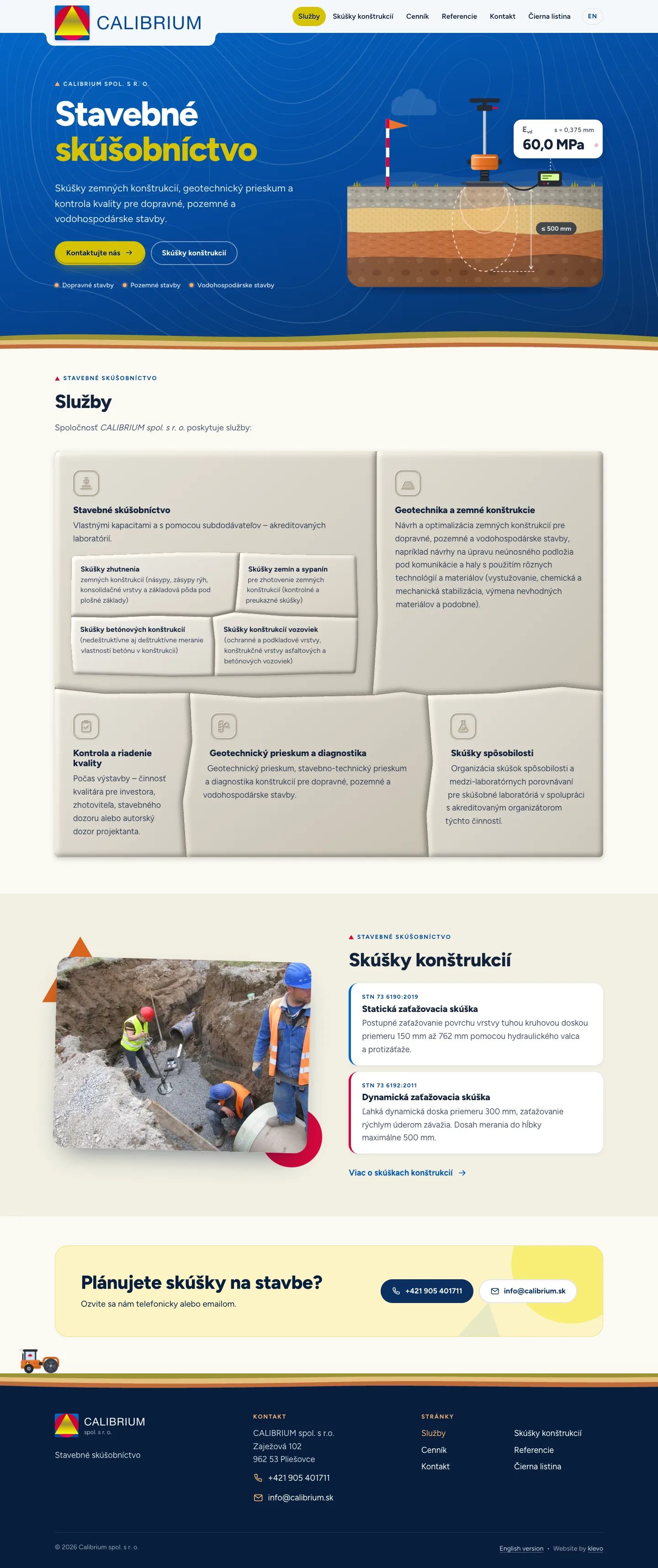
Calibrium spol. s r. o. is a construction testing company from central Slovakia. They measure how well embankments, trench backfills, road bases and foundations are compacted, run geotechnical surveys and supervise quality on road, railway and building sites. In October 2026 I launched a complete redesign of their website, built as a static Jekyll site with a visual language drawn from the company’s logo and the soil its people work with every day.
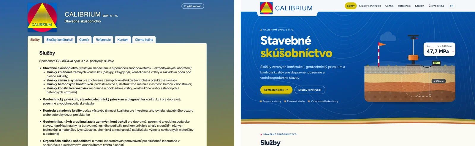
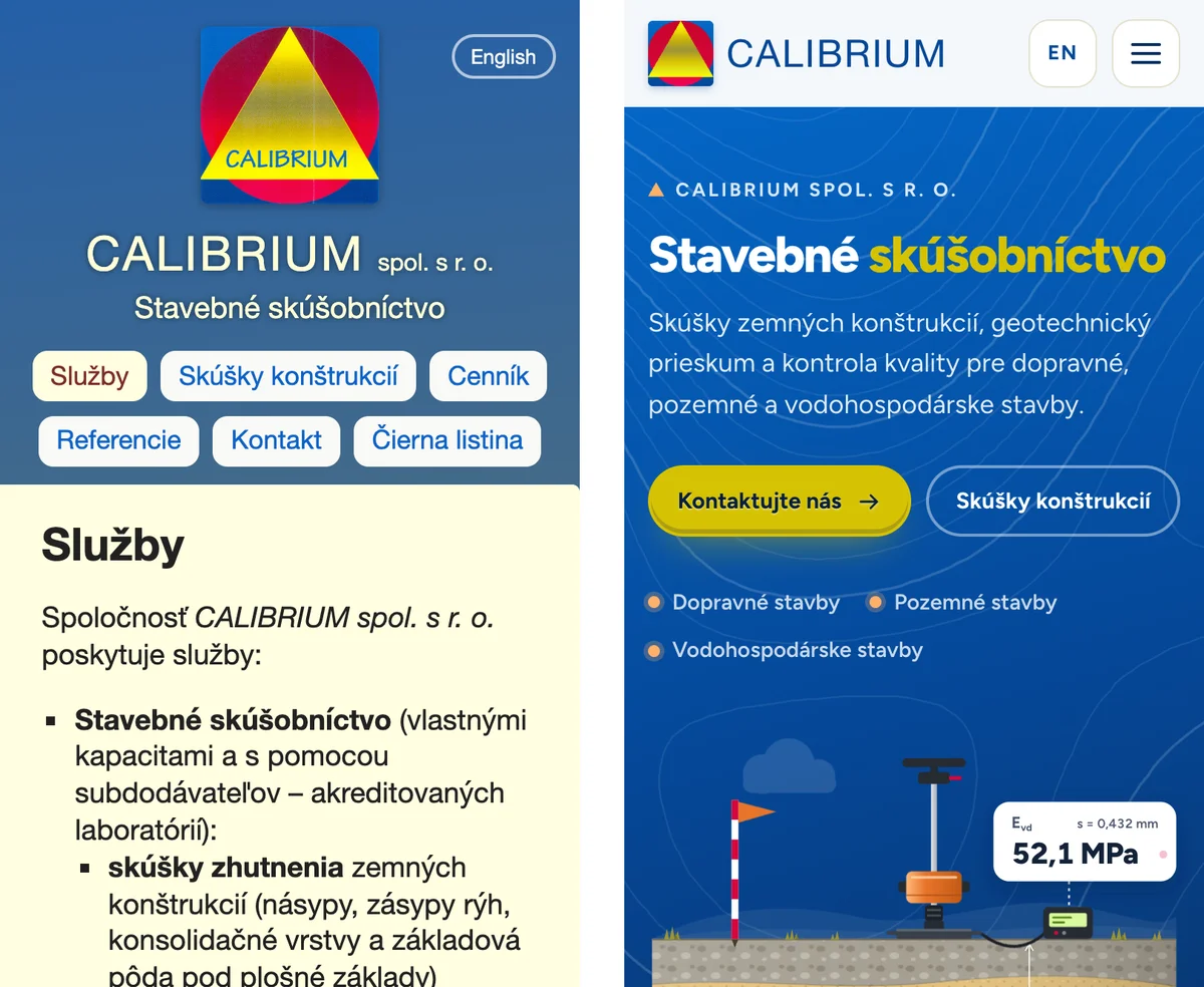
Before and after
The previous site was a WordPress theme from the early 2010s. In 2025 I had already moved its content to Jekyll and replaced WordPress with static hosting, keeping the old look intact. This year the client was ready for a new face.
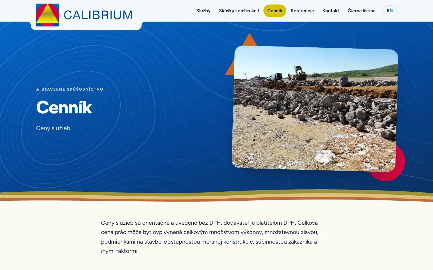
Palette from the logo, texture from the ground
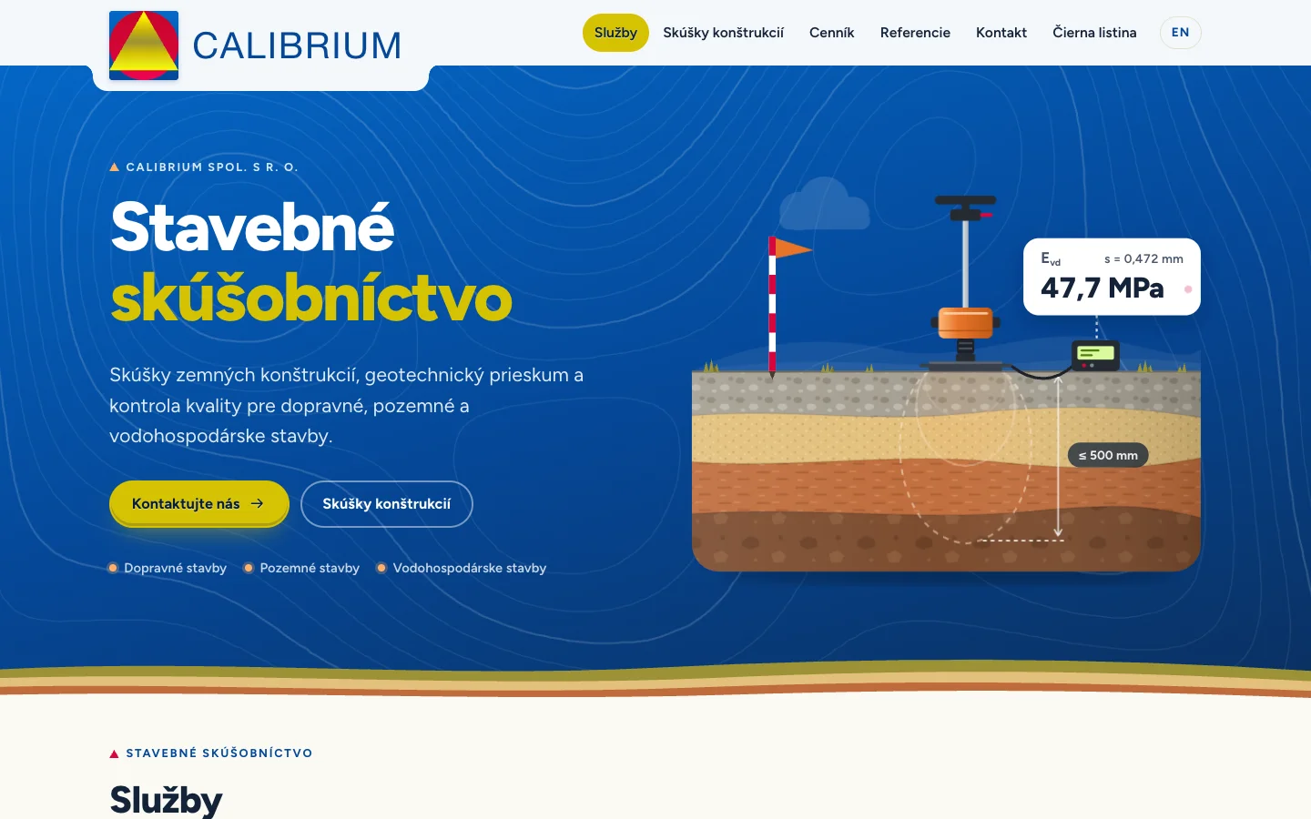
The Calibrium logo is a yellow triangle on a red circle on a blue square, a bold trio of primaries that is hard to tone down. Instead of fighting it, the design takes the blue as the hero background, the yellow as the single accent for buttons and the current navigation item, and leaves the red to the logo and small details.
The ground supplies the rest. Hero bands are closed off by wavy soil strata in olive, sand and burnt orange, and the blue heroes carry faint topographic contour lines in the background. Each inner page gets its own contour map, generated by a small script from a seed, so the pricing page never looks quite like the references page.
Animated test diagrams
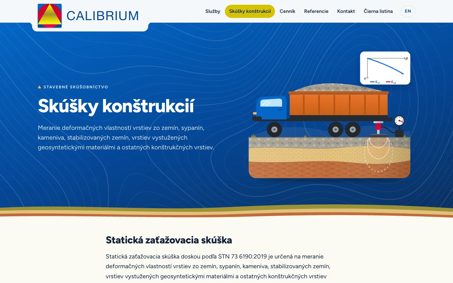
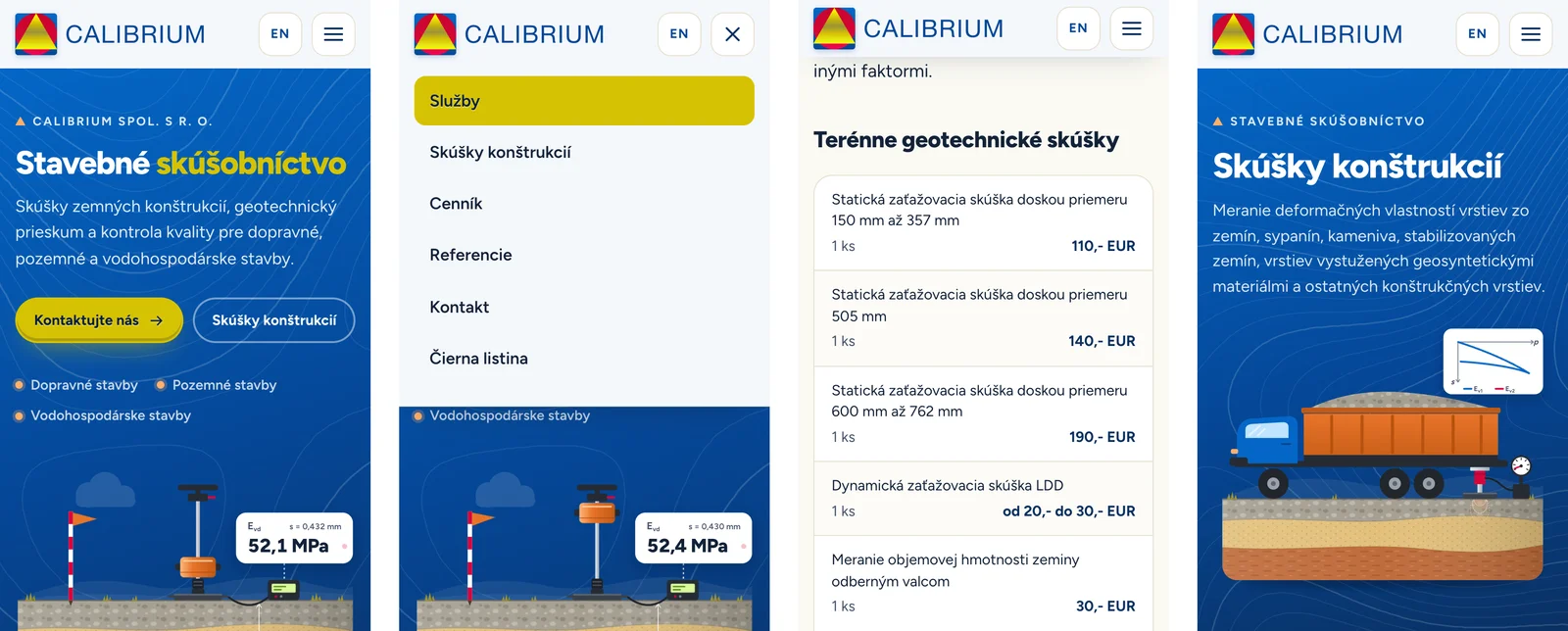
The company’s core service is the plate load test, so the homepage hero explains it with an animated SVG. A light dynamic plate drops its weight onto the ground, a pressure bulb spreads into the soil layers and the readout shows a fresh Evd value with every drop. The structural testing page has a second diagram of the static plate load test with a loaded truck as the counterweight, and a little vibratory roller drives across the footer of every page.
The animations are pure CSS keyframes on SVG groups. An IntersectionObserver pauses them while they are off screen and they stay still for visitors who prefer reduced motion.
A wall of services
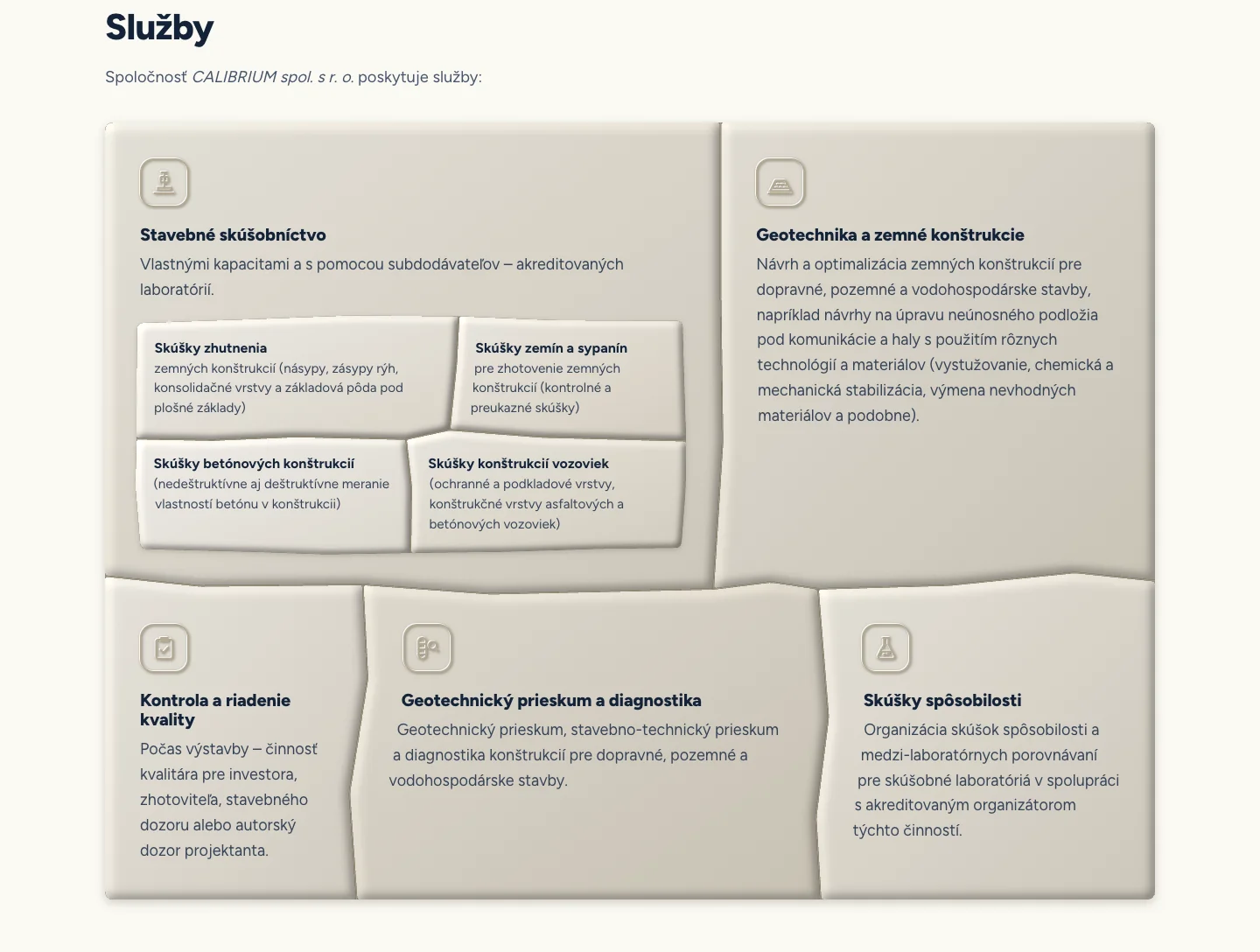
The services section was the hardest part to get right. A plain grid of cards felt generic for a company that spends its days on earthworks. The client suggested something closer to stone masonry, so the five services became an Inca style wall of interlocking polygonal stones.
The stones are laid out by a short script that fits the polygons to the grid, so the wall adapts to any viewport width without the joints crossing. Text inside each stone wraps along its slanted side joints using CSS shape-outside, the service icons are carved into the stone as subtle reliefs and the four testing items are inlaid as a smaller wall inside the first stone. Without JavaScript the section falls back to plain cards.
Details that matter for a small business site
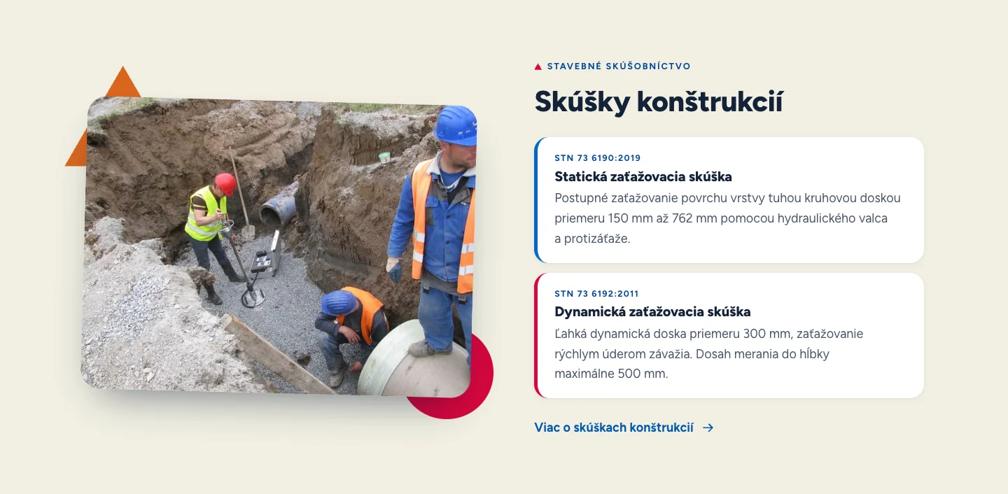
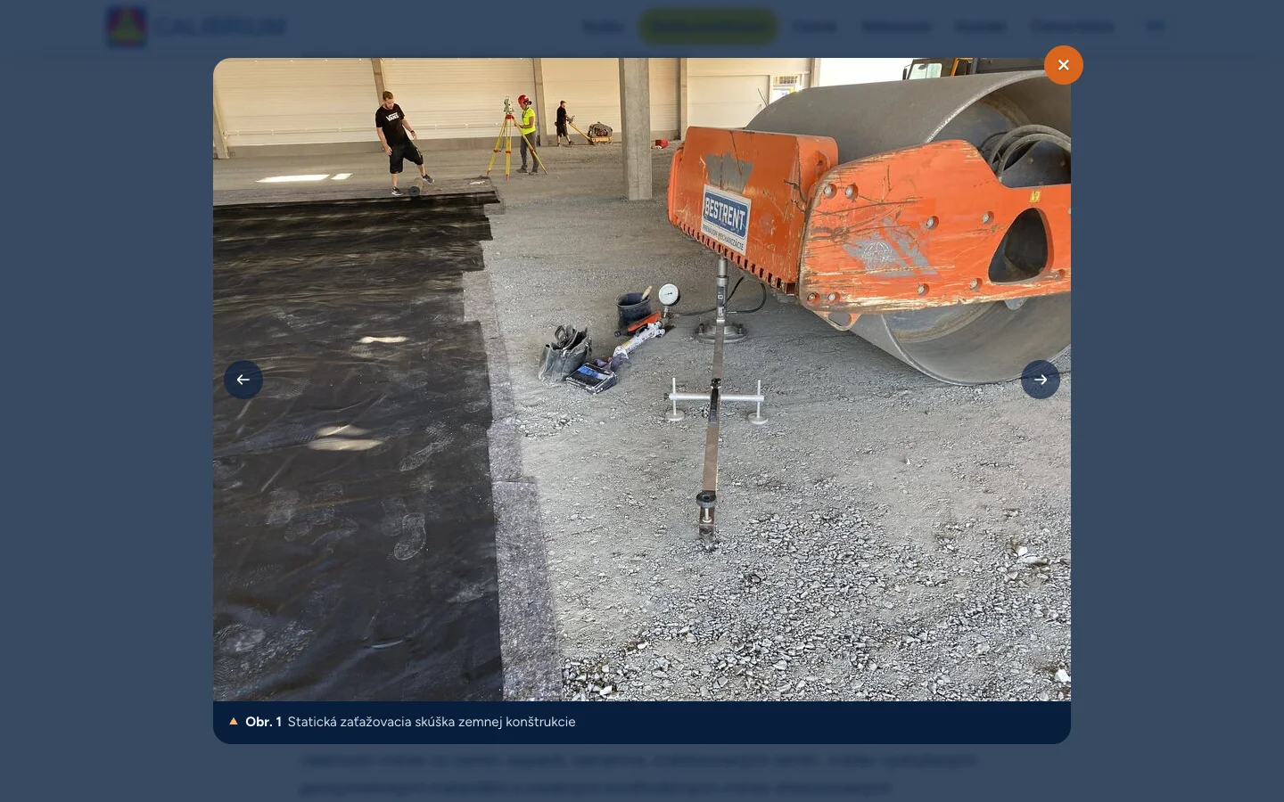
- Photo lightbox. Site photos open in a native
dialogwith previous and next navigation and a legend built from the figure caption. References like “(obr. 5)” in the text are clickable and open the matching photo directly. - Typography that holds together. A Jekyll build plugin turns the spaces inside “150 mm”, “STN 73 6190” and “spol. s r. o.” into non-breaking spaces on every rendered page, so a measurement never wraps away from its unit.
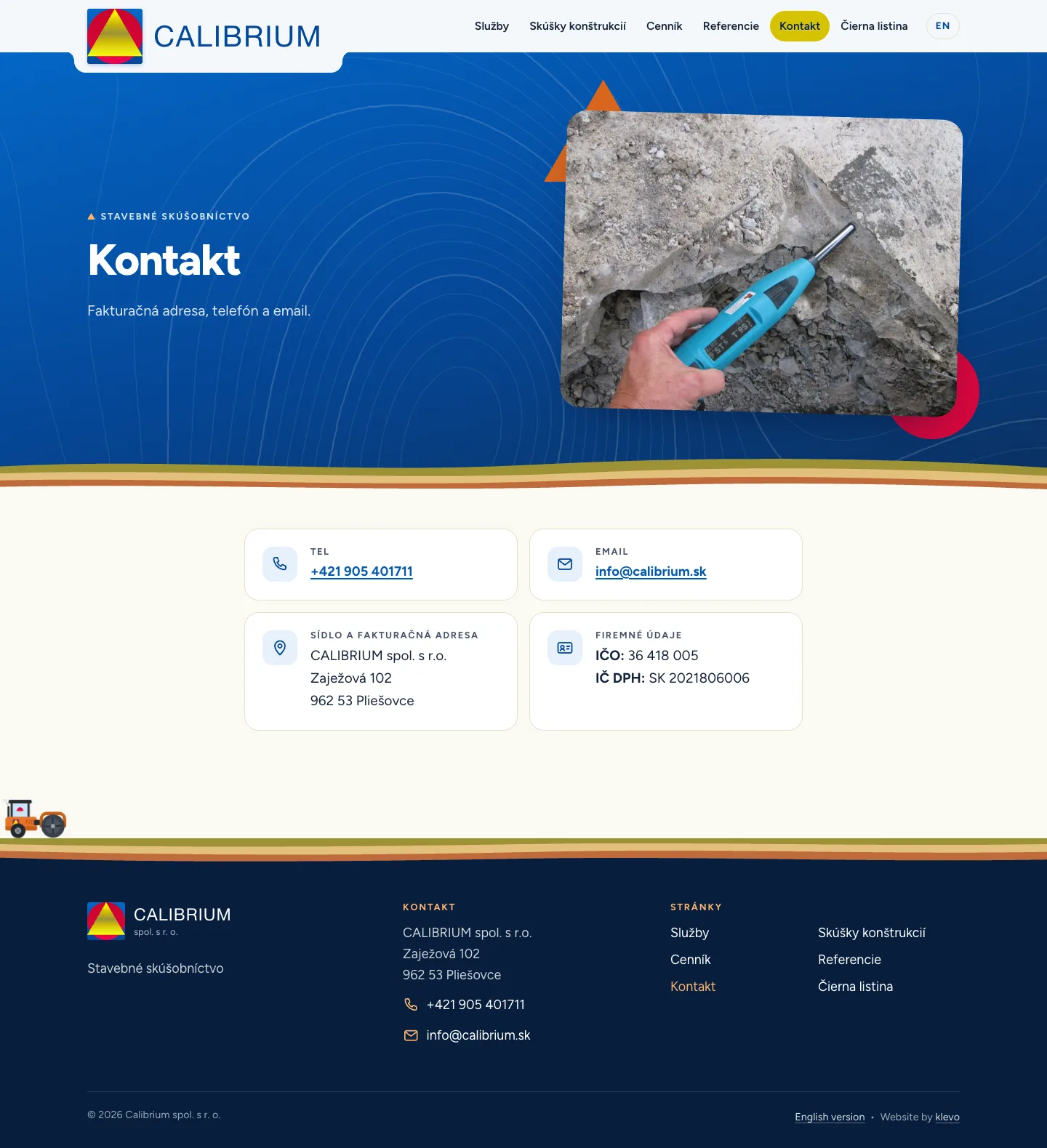
- Folding header. The logo hangs below the bar on a tab at the top of the page and folds into a slimmer bar as soon as you scroll.
- Price lists on phones. Under 720px each price row stacks into service, quantity and price, instead of squeezing a four column table onto a narrow screen.
- Two languages. Slovak and English share layouts, data files and translations with proper
hreflanglinks between them. - Self-hosted variable font. Figtree in two subsets, no third party requests.
- Web app manifest. The theme colour matches the header, so the browser chrome on a phone blends in with the page.
- Contact details are base64 encoded in the config and decoded in the browser, which keeps them away from simple scrapers.
Build and deployment
The whole site is Jekyll with Sass, a handful of Liquid includes and under 400 lines of vanilla JavaScript. There is no framework and no build pipeline beyond jekyll build. The redesign touched 57 files, added around 4 000 lines and went from the first commit to launch in two days, with a QA pass on a phone, a tablet and a desktop in between.
That pace was possible because this was an AI accelerated build. I directed the design, made the calls on layout, palette and interaction and reviewed every change, while Claude Opus 5.5 in Claude Code did much of the heavy lifting in Sass, SVG and JavaScript. The stone wall geometry, the contour map generator and the animated test diagrams would each have taken days on their own. I enjoyed the process tremendously. It felt like working with a tireless collaborator who let me spend my time on the parts that need taste and judgement.
Production deploys over SFTP to the client’s existing hosting with a script that mirrors the built site using lftp and pulls the password from the 1Password CLI, with a dry run mode that previews uploads and deletions first. For client review I added a one command preview deploy to a Cloudflare Worker on a subdomain of this site, which generates its Cloudflare configuration into a temporary directory so the repository stays free of it.